Written by
Andy Smith
Published on
May 22, 2026
Read time
min
Category
Trends
Struggling to choose colors for a room? The 60-30-10 rule is the simplest way to build a balanced, cohesive palette. Here's how to use it — plus the mistakes to av
Choosing colors for a room is where a lot of good intentions fall apart. You find three shades you love, put them together, and somehow it just feels off — too busy, too flat, or strangely unbalanced — without it being obvious why. The problem is almost never the colours themselves. It is the proportions.
Designers lean on one quietly brilliant guideline to get this right every time: the 60-30-10 rule. It takes the guesswork out of building a palette and gives any room a sense of balance that feels intentional rather than accidental. Here is exactly how it works, how to apply it room by room, and the small mistakes that trip people up.
What Is the 60-30-10 Rule?
The rule splits a room's color into three roles, in fixed proportions:
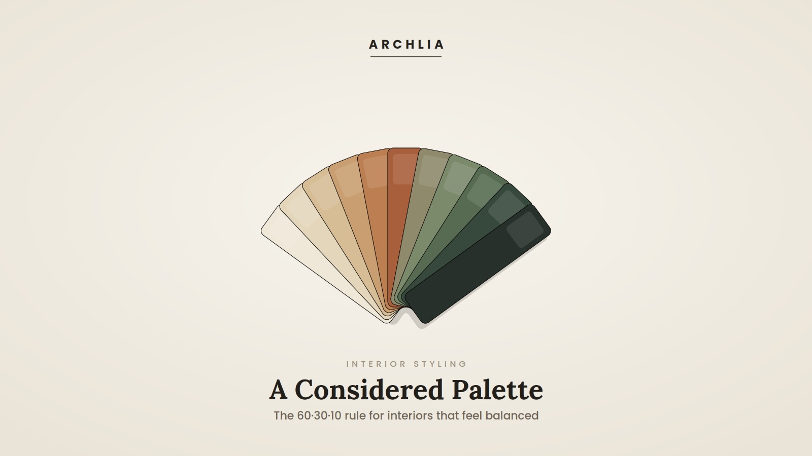
60% — the dominant color. The backdrop of the room: walls, ceilings, large rugs, the biggest pieces of furniture. It sets the overall mood and is usually the calmest, most neutral tone.
30% — the secondary color. Roughly half as present as the dominant. Think upholstery, cabinetry, curtains, bedding or a feature wall. It supports the dominant colour and adds depth.
10% — the accent. The smallest hit of color, and often the boldest: cushions, artwork, a vase, a lamp, smaller décor. This is where personality and contrast live.
That ratio — a large calm field, a supporting tone, and a small spark — is what makes a palette read as balanced rather than chaotic.
Why the Proportions Matter More Than the Colors
Almost any three colors can be made to work if the proportions are right — and almost any three can clash if they are not. Give every colour equal weight and the eye has nowhere to rest; the room feels noisy. The 60-30-10 split creates a natural hierarchy instead: something to settle on, something to support it, and something to draw the eye. It is the same principle that makes a well-composed photograph feel calm rather than cluttered.
How to Apply It, Step by Step
1. Start With the 60% — Your Anchor
Choose your dominant tone first, and keep it restrained. Soft neutrals — warm whites, greige, taupe, muted stone — are popular because they give the rest of the palette room to breathe and are easy to live with for years. Commit to this before anything else; everything is chosen in relation to it.
2. Add the 30% — Build Depth
Pick a secondary color that complements the dominant but is clearly distinct from it. A sage green, a soft clay, a deep blue or a richer version of your neutral all work well. This is the layer that gives the room character without overwhelming it.
3. Finish With the 10% — Add the Spark
Now you can be bold. The accent is small enough that a strong color — ochre, terracotta, forest green, navy — adds energy without taking over. Because it lives in easily swapped items (cushions, art, accessories), it is also the cheapest layer to refresh when you want a new look.
4. Mind Your Undertones
Within the rule, undertones are what make a palette feel truly cohesive. Warm neutrals sit best with warm accents; cool greys with cooler tones. When a palette feels subtly wrong despite the right proportions, mismatched undertones are usually the reason.
The 4 Most Common Palette Mistakes
Giving every color equal weight. The fastest way to make a room feel busy. Keep the hierarchy.
Choosing the accent first. Start with the dominant 60% and work down — not the other way around.
Forgetting that texture counts as color. Wood, stone, metal and fabric all carry tone; factor them into your proportions.
Ignoring the light. The same color shifts dramatically between a north-facing room and a sun-filled one. Always judge a shade in the actual space.
A Note on Texture and Materials
Color never lives in isolation. The warmth of timber, the cool of stone, the sheen of brass and the softness of a wool rug all read as part of the palette. The 60-30-10 rule works just as well when you think in materials and finishes as when you think in paint colours — which is exactly how a considered interior is put together.
From Palette to Finished Room
A palette can look perfect on a set of swatches and still surprise you on the wall, because color behaves differently across a whole room, in real light, at the real scale of your furniture. This is where seeing it first makes all the difference.
When you share your room and the direction you are drawn to, the Archlia design and styling team builds a balanced palette around the 60-30-10 principle — dominant, secondary and accent, with materials and finishes to match — and shows it to you as photorealistic 3D visuals. You see the colors and textures together, in your actual space, before committing to a single tin of paint or roll of fabric.
In short: you choose the direction, we balance and visualize it, then style the finished room — so the palette you fall for on screen is the one you get to live in.
Frequently Asked Questions
Does the 60-30-10 rule work with neutral or all-white schemes?
Yes. In a neutral scheme the three roles are played by different tones and textures rather than different colors — a pale wall, a deeper natural fabric, and a darker timber or stone accent.
Can I use more than three colors?
You can, but it helps to group them. Treat several closely related shades as a single "role" so the overall 60-30-10 balance still holds.
Where does the accent color go?
In the easiest things to change — cushions, throws, art, ceramics, a lamp. That way you can refresh the whole feel of a room without redecorating.
How do I stop a bold accent from looking like too much?
Keep it to roughly 10% and repeat it in two or three small places around the room, rather than one large block. Repetition reads as intentional; a single large patch can read as a mistake.
Ready to Get Your Palette Right?
If you would like a color palette that feels balanced and considered — and to see it in your own space before you commit — share your room and a few photos with us using the form below, and our team will take it from there.
Get in touch with the Archlia team →